


Hi Newgrounds!
I should've mentioned before that I've been in the graphic design business as of late, Doing some for my networks, Maxima and G4EVER.
The profile pictures are basic, but get the message through.

But the banners, I'm somewhat proud of those.
I plan to do more of these, maybe even take commissions to rebrand some networks, artist signatures, etc.
Do let me know what you think!
T'ill next time, NG!
Ceejaythe630th
The Logo and banners look phenomenal!
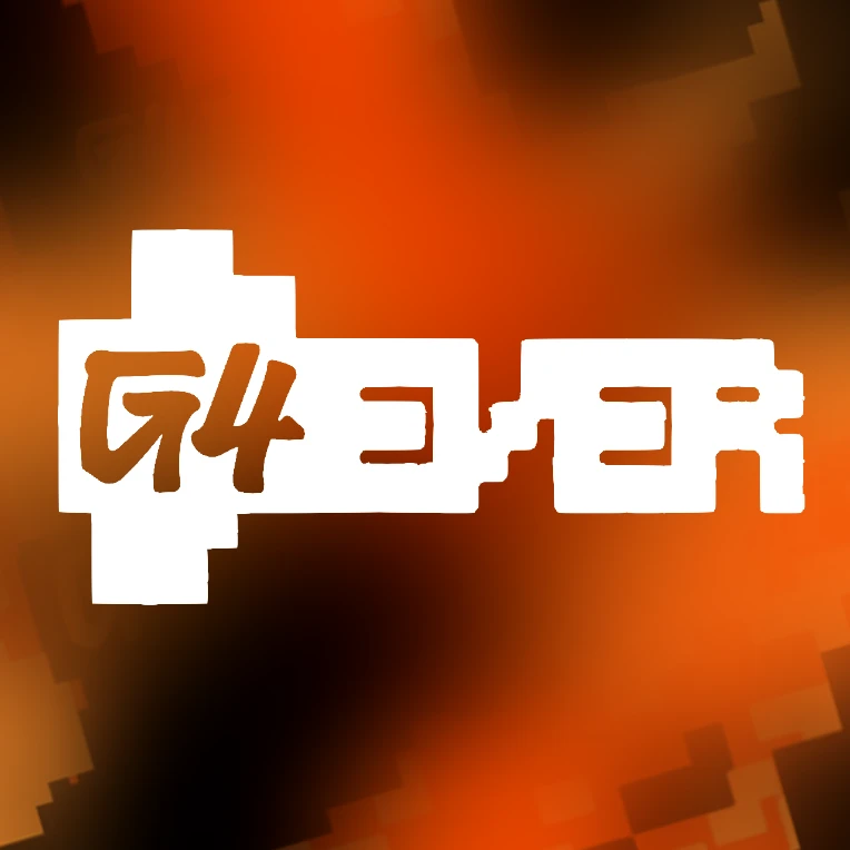
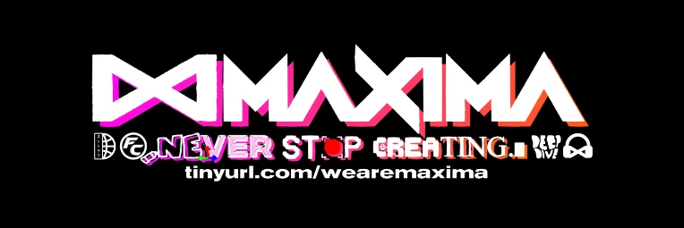
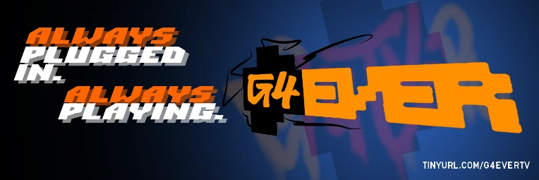
I like how most of it has a fragrance of graffiti art-styles to them, while imitating sharp pixels from retro games. This makes it feel like this would be something you would see in the 90s, and I love it. The colors and different fonts for the Maxima banner are awesome, with the name having it's own font, while the words of the slogan are a combination of fonts. The G4EVER Banner follows the graffiti and pixel pattern by having the G4 in a graffit-esque font and the EVER being hand-drawn pixels, with the pixels even surrounding the G4. The slogan being in a retro font with it's signature color on the "Always" is a nice touch.
Nitpicks: PFPs: The Maxima logo looks like it's low quality here. If it was more sharp and cleaner like the retro fonts in the G4EVER banner, I think it would look better. With G4EVER though, I'm noticing small bits of color poking out of some of the letters (Like how the bottom line of the E isn't completely straight). Personally, it just needs a few more touchups and then it'll be good to go.
Banners: The Maxima banner looks nice, but the logo is kind of having the same problems as I mentioned with the PFP. That aside though, I have to question why the slogan was worded the way it is: "DO NEVER STOP CREATING". Honestly, I have never heard of someone wording it this way. Something to make it make more sense would be to just word it as: "DON'T EVER STOP CREATING", or "NEVER STOP CREATING". People might get what you're saying, but this should get the message across better. For the words with different fonts: Don't use multiple fonts in one word. It kind of feels messy to look at if you do this, but if you give each word a single different font, then it would make it feel less messy and more appealing to people.
The G4EVER logo is good as is, but I feel like it would be better if the hand-drawn pixels were actual pixels, just to make it feel a bit cleaner.
That's all I can say from this, and as a rating: 8.5/10
Good luck on your business ventures!
DannoDorkus
The "DO NEVER STOP CREATING" bit was a mistake on my end, The actual slogan is "NEVER STOP CREATING", And the DO part is the icons for the shows they produce (Netsurf, Filmcrew), I'll see about fixing those within time, Thanks for letting me know though, I'm glad you pointed it out so I can prevent confusion with the viewer!
The G4EVER Logo Implements the G4 logo from 2006-2014 and the Original from 2002. I figured these would work as callbacks to both generations of G4TV, as my goal is to make it a heartfelt comeback, something G4 failed to do in 2021 (Not cause of the whole "Woke" bs that people say online, It was more so Comcast didn't exactly understand the budget, nor that people don't really watch cable anymore, even it was streaming, it relied on Nostalgia and didn't feel like they were dishing out much for the gamers.
I'm glad you pointed out the issues with the logos, They are all I currently have at the moment, however I'm planning on remaking these logos to have them just a bit cleaner, just for now these work until then, Mainly since they won't be seen in such a big light, Mostly in a small view. Think of em as placeholders for now.
Thanks for the rating, and the good luck wish! I'm doing my best to make these two networks happen, and I'm glad to get feedback for it!